
Welcome to Top Follow. Instagram logo is more than just a simple app icon; it has become a powerful symbol of creativity, communication, and digital expression worldwide. Since Instagram launched, its visual identity has played an important role in shaping how people recognize and connect with the platform. From the original vintage camera design to the modern colorful gradient symbol, the Instagram logo reflects the platform’s transformation from a photo-sharing application into one of the most influential social media platforms in the world. Its simple yet memorable design has helped establish a strong brand identity that millions of users instantly recognize.
Understanding the story behind the Instagram logo helps designers, marketers, businesses, and everyday users appreciate the importance of effective visual branding. The logo represents more than photography; it communicates ideas of creativity, community, innovation, and self-expression. Whether you are searching for an Instagram icon for a website, exploring the Instagram app icon history, or looking for an Instagram logo PNG or Instagram logo SVG file for design purposes, knowing its evolution and proper usage can help you make better branding decisions.
What Is the Instagram Logo?
The Instagram logo is the official visual symbol used to represent Instagram across its mobile application, website, marketing materials, and digital platforms. It acts as a recognizable gateway to the platform, allowing users to instantly identify Instagram among thousands of other applications. The modern design features a simplified camera outline placed over a vibrant gradient background, representing photography, creativity, and visual storytelling. As a key part of Instagram’s brand identity, the logo communicates the platform’s focus on sharing moments, connecting communities, and expressing creativity through images and videos.
A Quick Overview
The current Instagram logo is a modern representation of a camera, designed with simplicity and flexibility in mind. Unlike the original realistic camera design, the updated version uses clean lines and a minimal structure that works effectively across different screen sizes, from small mobile app displays to large digital advertisements. This approach allows the Instagram app icon to remain clear, recognizable, and visually appealing in every environment.
The design includes a rounded square shape, a white camera outline, a central lens circle, and a colorful gradient background. These elements combine to create an Instagram icon that represents photography while also reflecting creativity, technology, and modern communication. The simplicity of the design makes it easy for users to identify the app instantly without needing additional text or explanation.
Why the Logo Is So Recognizable
The Instagram logo has achieved worldwide recognition because of its unique combination of simplicity, color, and consistency. Many social media logos compete for users’ attention, but Instagram’s bright gradient design creates an immediate visual connection. The use of bold colors helps the logo stand out on crowded smartphone screens, while the camera symbol maintains a strong connection to the platform’s original purpose.
Another reason behind its popularity is Instagram’s consistent branding across millions of websites, advertisements, creator profiles, and business pages. Whether users see the Instagram app icon on their phone or an Instagram logo PNG on a website, they immediately associate it with photos, videos, creators, and online communities. This consistent presence has helped transform the Instagram logo into one of the most recognizable digital symbols in modern branding.
History of the Instagram Logo
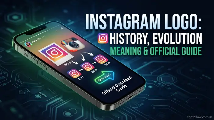
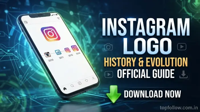
The history of the Instagram logo shows how a simple camera symbol transformed into one of the most recognizable social media logos in the world. Since Instagram launched in 2010, the company has redesigned its visual identity several times to match changing technology, user expectations, and modern branding trends. Each version of the logo represents a different stage of Instagram’s growth, from a small photo-sharing application to a global platform for creators, businesses, and communities. The logo evolution of Instagram reflects the shift from detailed, realistic designs toward simple, memorable, and adaptable digital branding.
The Original Instagram Logo (2010)
The first Instagram logo was introduced when the platform launched in 2010. Unlike the modern minimalist design, the original logo looked like a realistic vintage Polaroid camera with detailed textures, a large lens, and a classic camera body. The design was created to represent Instagram’s original purpose: helping users capture, edit, and share photographs with others around the world.
The vintage appearance of the first Instagram app icon was closely connected to photography culture and nostalgia. It communicated the idea of preserving special moments, similar to traditional cameras used before smartphone photography became dominant. Although the design was more complex than today’s version, it successfully established Instagram’s connection with images, creativity, and personal storytelling.
First Camera Logo (2011)
In 2011, Instagram introduced a refined version of its camera design to create a cleaner and more recognizable Instagram icon. The updated logo maintained the vintage camera concept but improved its shape, colors, and overall appearance. This redesign helped the logo look more professional as Instagram began attracting millions of users worldwide.
The updated camera symbol became an important part of Instagram’s early brand identity. It balanced the feeling of classic photography with the needs of a growing digital platform. During this period, the instagram logo became strongly associated with photo filters, creativity, and online visual communities, helping Instagram stand apart from other emerging platforms.
The Major Redesign (2016)
The biggest change in the history of the Instagram logo happened in 2016 when Instagram completely replaced its realistic camera design with a modern, minimalist icon. The company introduced a simplified white camera outline placed over a bright gradient background featuring colors such as purple, pink, orange, and yellow.
This redesign represented Instagram’s transformation from a simple photo-sharing app into a complete visual communication platform. The new design focused on simplicity, flexibility, and recognition across different devices. The modern Instagram app icon was easier to display on smartphones, websites, and advertisements while creating a stronger connection with contemporary brand identity principles.
Although many users initially had mixed reactions to the new design, the redesigned instagram logo quickly became familiar worldwide. Its bold colors and clean shape helped Instagram create a unique visual presence among other social media logos, making it instantly recognizable even without the company name.
Logo Refresh (2022)
In 2022, Instagram introduced a subtle refresh rather than a complete redesign. The company adjusted the gradient colors of the instagram logo to make them brighter and more vibrant. The overall structure remained the same, allowing users to recognize the familiar camera symbol while experiencing a more modern appearance.
The refreshed design focused on improving consistency across Instagram’s digital platforms and strengthening its connection with the wider Meta ecosystem. The updated Instagram icon continued to represent creativity, connection, and self-expression while maintaining the simplicity that made the 2016 version successful.
Timeline Table of Logo Changes
| Year | Logo Design | Key Features | Purpose of Change |
| 2010 | Original vintage camera | Realistic Polaroid-style camera with detailed textures | Represented photography and image sharing |
| 2011 | Refined camera design | Cleaner shape and improved visual balance | Created a stronger and more recognizable icon |
| 2016 | Modern gradient camera | Minimal camera outline with colorful background | Modernized the brand for digital platforms |
| 2022 | Gradient refresh | Brighter colors with the same camera symbol | Improved visual consistency and modern appeal |
The complete logo evolution of Instagram demonstrates how successful brands adapt while keeping their core message intact. From the original camera-inspired design to the current colorful symbol, the instagram logo continues to represent creativity, connection, and the power of visual storytelling in the digital world.
Read Also: Instagram Lite
Meaning Behind the Instagram Logo
The Instagram logo carries a deeper meaning than simply representing a photo-sharing application. Every element of the design, from the camera shape to the colorful gradient, was created to communicate Instagram’s values of creativity, connection, and self-expression. The Instagram icon represents the evolution of digital communication, where images and videos have become powerful tools for storytelling. Through its design choices, the logo reflects Instagram’s mission to help people share experiences and build communities around visual content.
Camera Symbol
The camera symbol in the Instagram logo represents the platform’s original purpose as a photography-focused application. When Instagram launched, it was built around capturing, editing, and sharing photos, making the camera a natural choice for its visual identity. Even after Instagram expanded into features like Stories, Reels, messaging, and shopping, the camera remained an important symbol of creativity and visual expression.
The simplified camera shape used in the modern Instagram app icon represents more than traditional photography. It reflects the idea of capturing everyday moments, sharing memories, and connecting with audiences worldwide. The clean camera outline allows users to instantly recognize the social media logo while maintaining a strong connection to Instagram’s creative roots.
Gradient Colors
The vibrant gradient colors of the instagram logo are one of the most recognizable parts of its design. The combination of purple, pink, orange, and yellow creates a feeling of energy, creativity, and diversity. Unlike a single-color design, the gradient gives the logo a dynamic appearance that represents the wide range of content and personalities found on Instagram.
The colors also play an important role in creating a memorable brand identity. The unique gradient helps the Instagram icon stand out among other digital platforms and makes it easily identifiable on smartphones, websites, and advertisements. The use of bright colors communicates positivity, innovation, and the endless possibilities of visual storytelling.
Simplicity and Modern Branding
The modern Instagram logo follows the principles of minimalist design, where simplicity creates stronger recognition. Instead of using a detailed camera illustration, Instagram adopted a clean outline that works effectively across different devices and screen sizes. This approach allows the logo to remain clear whether it appears as a small Instagram app icon or a large marketing graphic.
Modern companies often use simple designs because they are easier for audiences to remember and recognize. The Instagram logo demonstrates how a simple symbol can communicate a powerful message without requiring text. By combining a minimal camera shape with a distinctive color style, Instagram created a timeless brand identity that continues to influence modern social media branding and digital design trends.
Instagram Logo Colors Explained
The Instagram logo uses a carefully designed color system that helps communicate creativity, energy, and connection. The combination of vibrant shades makes the Instagram icon instantly recognizable and separates it from other social media logos. The colors are not only used for visual appeal but also support Instagram’s brand identity by representing diversity, imagination, and modern digital expression.
Instagram Logo Colors
- The Instagram logo uses a vibrant gradient of purple, pink, orange, and yellow to create a unique and recognizable visual identity.
- The official gradient represents creativity, diversity, and the variety of photos, videos, and stories shared on Instagram.
- The Instagram icon uses color psychology to create emotions such as creativity, happiness, energy, and connection among users.
- Purple represents imagination, pink reflects community and self-expression, orange shows excitement, and yellow communicates positivity.
- Instagram uses a gradient because it helps the instagram logo stand out from other social media logos and improves brand recognition.
- The colorful design supports Instagram’s brand identity by creating a modern, flexible, and memorable appearance across different platforms.
- The gradient allows the Instagram app icon to remain attractive and easily recognizable on smartphones, websites, advertisements, and marketing materials.
Official Instagram Logo Guidelines
The Instagram logo is a protected visual asset that represents Instagram’s official brand identity, so it should always be used carefully and correctly. Whether you are a business owner, designer, marketer, or content creator, following the proper Instagram brand guidelines helps maintain consistency and prevents misuse of the logo. The rules ensure that the Instagram icon remains recognizable while protecting Instagram’s reputation as a global social media brand.
When You Can Use the Logo
The Instagram logo can be used in certain situations where you need to show a connection with Instagram or direct users to an official Instagram profile. Businesses, websites, and creators commonly use the Instagram app icon on social media buttons, websites, promotional materials, and digital content to help audiences find their Instagram presence.
You can typically use the logo for purposes such as linking to an Instagram account, mentioning Instagram in articles, displaying social media connections, or creating educational content about the platform. However, the Instagram logo should always appear in its original form and follow the recommended spacing, size, and placement rules.
What You Should Not Do
When using the Instagram logo, avoid making changes that could damage its original design or create confusion about the brand. You should not stretch, rotate, recolor, redesign, or add effects to the logo because these modifications can reduce its recognition and affect Instagram’s brand identity.
Common mistakes include using low-quality images, changing the gradient colors, adding extra elements, or placing the Instagram icon on backgrounds where it becomes difficult to see. Maintaining the original appearance ensures that the logo remains professional and consistent across all platforms.
Brand Assets and Permissions
Instagram provides official brand resources to help users access approved versions of the Instagram logo and related materials. Using official files such as the Instagram logo PNG or the Instagram logo SVG ensures better quality and prevents the use of outdated or unofficial versions.
The logo and other brand assets are protected by trademark rights, meaning users should respect Instagram’s ownership and usage requirements. Following proper permissions and Instagram brand guidelines helps businesses and creators use the logo professionally while maintaining trust and credibility.
Common Mistakes When Using the Instagram Logo
Using the Instagram logo correctly is important for maintaining a professional appearance and protecting Instagram’s brand identity. Many businesses, designers, and website owners make simple mistakes when adding the Instagram icon to their platforms, which can make the logo look unprofessional or violate official Instagram brand guidelines. Understanding these common errors helps ensure that the logo remains clear, recognizable, and consistent across all digital and print materials.
Stretching the Logo
One of the most common mistakes when using the instagram logo is stretching or changing its original proportions. A distorted logo can appear unprofessional and reduce the visual impact of the Instagram app icon. Logos are carefully designed with specific dimensions, so changing their shape can affect how users recognize the brand.
Always maintain the original width and height ratio when resizing the logo. Whether you are using an Instagram logo PNG or an Instagram logo SVG, make sure the design scales properly without becoming wider, narrower, or uneven.
Changing Colors
The official colors of the Instagram logo are an important part of its recognition. Changing the gradient, replacing the colors, or applying custom filters can weaken the connection between the logo and Instagram’s brand identity. The original colors help users instantly identify the social media logo.
Avoid modifying the logo to match your website or marketing theme. Instead, use the approved version provided through official Instagram brand guidelines to maintain consistency and professionalism.
Removing Clear Space
Clear space around the instagram logo allows it to remain visible and easy to recognize. Placing text, images, or other design elements too close to the Instagram icon can make it appear crowded and reduce its visual quality.
A proper amount of empty space helps the logo stand out on websites, advertisements, and promotional materials. Following spacing recommendations creates a cleaner design and improves the overall presentation of your brand assets.
Using Unofficial Versions
Using unofficial or modified versions of the Instagram logo can create branding problems. Low-quality copies found on random websites may contain incorrect colors, outdated designs, or poor-quality details that do not match the official Instagram app icon.
Always choose trusted sources when downloading logo files. Official Instagram logo PNG and Instagram logo SVG formats provide better quality and ensure that your designs follow proper usage standards.
Low-Resolution Graphics
Using a low-resolution version of the Instagram logo can make your design look blurry and unprofessional. This problem often happens when users download small images and enlarge them for websites, banners, or printed materials.
For the best results, use high-quality formats such as vector files or large transparent images. A clear Instagram icon improves the appearance of your marketing materials and helps maintain a strong, professional brand identity.
Tips for Using the Instagram Logo Professionally
Using the instagram logo professionally helps maintain a consistent and trustworthy visual identity across different platforms. Designers should use high-quality files like Instagram logo SVG and avoid modifying the original design, while businesses can use the Instagram icon on websites, advertisements, and promotional materials to connect audiences with their profiles. Bloggers should add the logo naturally to their content, developers should ensure proper placement and sizing in digital interfaces, and digital marketers should use approved brand assets to create professional campaigns while following Instagram brand guidelines. Proper usage of the logo improves recognition, protects Instagram’s brand identity, and creates a better experience for users.
Tips for Using Instagram
- Designers: Use the Instagram logo in its original format without changing the shape, colors, or proportions. Choose high-quality files such as an Instagram logo SVG for professional designs and maintain proper spacing to keep the Instagram icon visually balanced.
- Businesses: Add the Instagram logo to websites, marketing materials, and promotional content to guide customers toward your official profile. Follow Instagram brand guidelines to maintain a trustworthy and consistent brand identity.
- Bloggers: Use the Instagram app icon on blogs, author pages, and social media sections to help readers connect with your Instagram account. Avoid unofficial versions and always use a clear, recognizable Instagram logo.
- Developers: Implement the Instagram logo correctly in apps, websites, and user interfaces by maintaining proper size, alignment, and visibility. Use approved brand assets to create a professional user experience.
- Digital Marketers: Include the Instagram logo in campaigns, advertisements, and social media strategies to improve brand recognition. Ensure the logo follows official Instagram brand guidelines and supports your overall social media branding efforts.
Frequently Asked Questions
What is the Instagram logo?
The Instagram logo is the official symbol of Instagram, featuring a camera outline with a colorful gradient that represents creativity and visual sharing.
Why did Instagram change its logo?
Instagram updated its Instagram logo in 2016 to create a simpler, modern design that works better across digital platforms.
Can I use the Instagram logo on my website?
Yes, you can use the logo to link to Instagram or show your presence, but you should follow Instagram brand guidelines.
Where can I download the Instagram logo?
You can find official versions of the Instagram logo in formats like Instagram logo PNG and Instagram logo SVG from trusted sources.
What do the Instagram logo colors represent?
The colors represent creativity, energy, diversity, and connection while strengthening Instagram’s brand identity.
Conclusion
The Instagram logo has become one of the most recognizable social media logos in the world, representing creativity, connection, and visual storytelling. From its original vintage camera design to the modern gradient icon, its logo evolution shows how Instagram has adapted to changing digital trends while maintaining a strong connection with photography and self-expression.
Understanding the meaning, colors, history, and proper usage of the Instagram logo helps designers, businesses, bloggers, and marketers use it more effectively. By following Instagram brand guidelines, using official brand assets, and avoiding common design mistakes, you can maintain a professional appearance while respecting Instagram’s unique brand identity. The simple yet powerful design of the Instagram logo continues to represent creativity and communication across the digital world.
